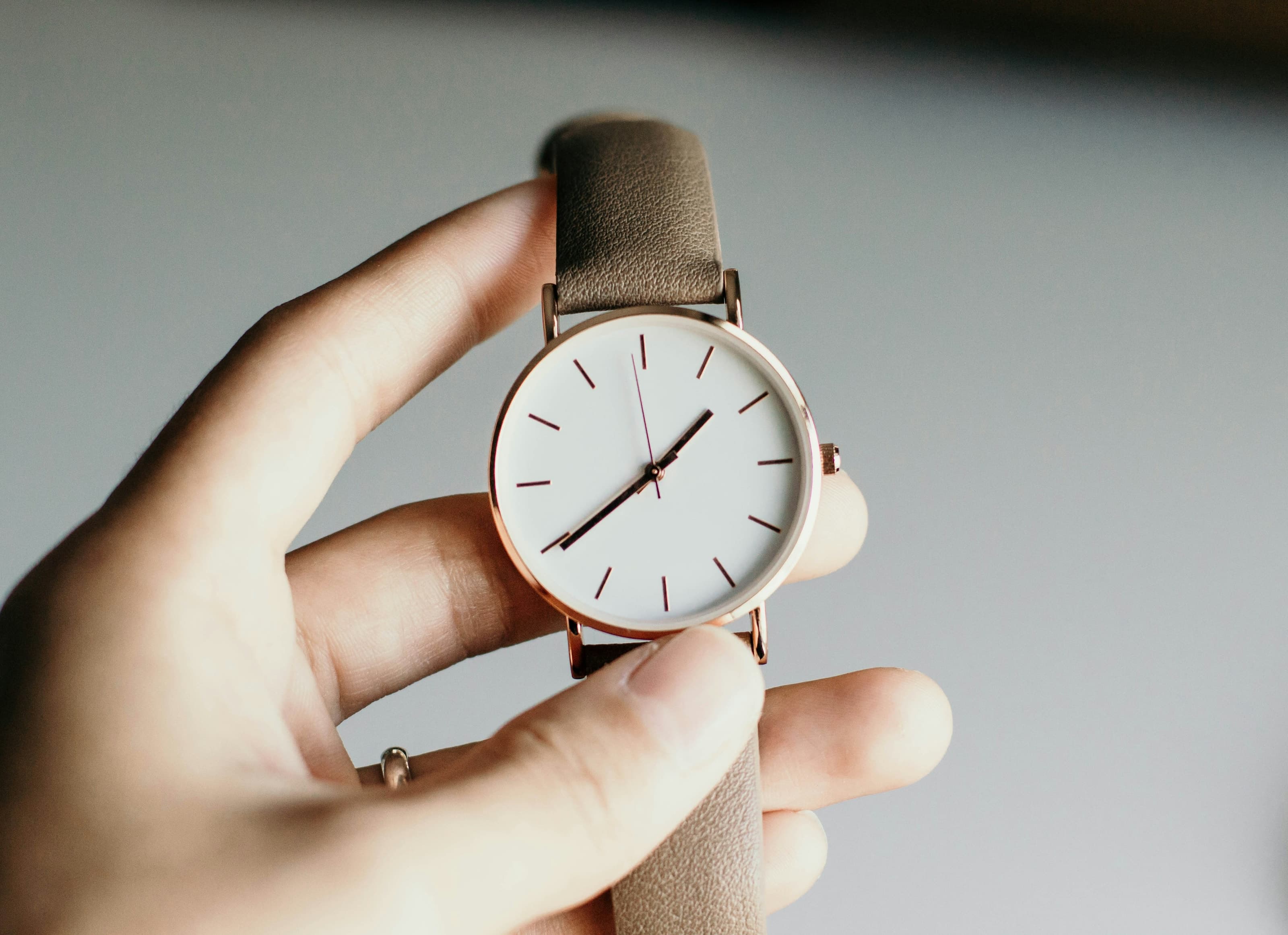
Metal Against the Dark
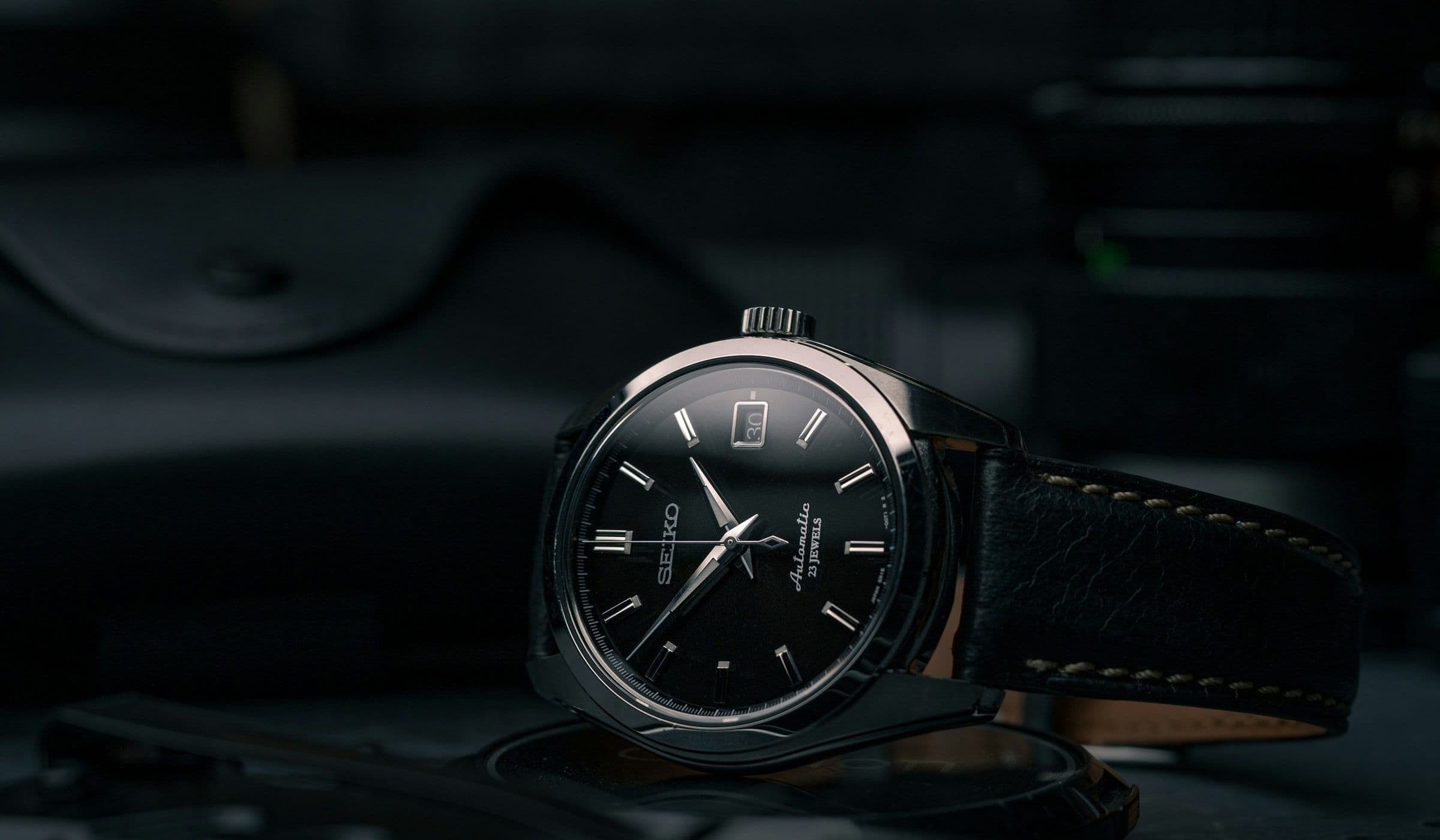
Some dials need a bright room. The ones worth studying need the opposite: a fall in the light that leaves metal and lume to do the talking. Display cases and launch photography lie by generosity. They flood the face until every surface agrees to shine. Real wearing happens in half-light: a restaurant table, a car at night, a hallway where the only reference is a dim sconce.
Against the dark, indexes become decisions. A hand’s length is no longer decorative. The case edge is a horizon. What was polished for a window display is suddenly asked to work at arm’s length, at night. Too much polish throws spurious points; too little and the dial dies. The successful watch finds a middle brightness: enough metal to read, not enough to become jewellery.
This is the reading that matters. Not the photograph under a lamp, but the moment the watch is the only bright object in the frame, and it still looks composed. Composition here is spacing: the distance between indices, the weight of the handset, the quiet zone around a logo that either disappears or shouts. Dark backgrounds punish logos that were sized for daylight.
Lume is the second metal. It stores light and returns it slowly, changing the dial’s hierarchy after sunset. Generous lume can flatten a face into a toy; timid lume makes the watch useless without stealing glances at a phone. The best implementations treat lume as texture on indices, not as paint poured into every surface. Against the dark, you learn which watches were planned for night and which were planned for press events.
Case shape participates even when the dial is the subject. A reflective bezel can throw a crescent of distraction into an otherwise calm face. Brushed case sides disappear; polished bevels become lines in space. Owners who wear black learn which watches stay visually quiet and which become flashing signals with every wrist movement.
Hands are silhouettes first, metal second. At night, shape tells time more than finish. A syringe hand reads differently from a baton when only lume remains. Length errors that were forgivable at noon become cruel in theatre dimness. Metal against the dark is therefore a test of proportion before it is a test of material.
Dial colour shifts with context. A blue that looked royal under sun can read as grey in a bar. Grey that seemed safe becomes invisible. Black-on-black designs assume confidence: they ask the owner to know their watch by touch and by the faintest edge of light. Those watches either become favourites or live in drawers; there is little middle ground.
Straps and bracelets change the frame. A polished link catches a stray highlight and breaks the dial’s monopoly on attention. Rubber can disappear entirely, making the case float. Leather absorbs light and can make the watch feel warmer, more human. The dark reading includes what surrounds the metal face, not only the face itself.
Photographers know this instinctively. Many iconic watch images were taken near failure exposure: one stop away from losing the hand, one stop from blowing a highlight on a crystal’s edge. Collectors repeat that experiment at home, turning away from lamps, relying on a single window. The watches that survive that test are the ones whose metal was shaped for real contrast ranges, not for retouching, and whose lume was rationed rather than poured.
What you learn from metal against the dark is restraint. A dial that declares itself without shouting suggests the same restraint inside the case. It is a visual ethics: the watch does not demand the room’s light; it uses what the room offers. That is why certain pieces feel mature on the wrist. They were drawn for evenings, for discretion, for the hour when everything else has already gone quiet, and they still read clearly when you glance down without turning your wrist toward a lamp.
Key Highlights
Light Withdrawn
The dial declares itself when the room stops helping, and metal must speak without glare or clutter.
Indexes as Decisions
Length, polish, and lume are judged at arm’s length at night, where decoration becomes legibility or failure.
Composed Alone
The watch remains the only bright object in the frame, and still holds its spacing and hierarchy.